Color photography (and II): image and color
1995/06/01 Nogeras, Itziar - Elhuyar Fundazioa Iturria: Elhuyar aldizkaria
There are three main elements for color detection: the source of “white light” (sunlight and tungsten lamp, for example), the materials that absorb some wavelengths and reflect others (in this way shown colored) and the ability of the human eye to see the set of wavelengths in one or another color.

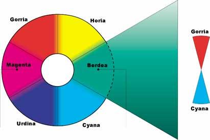
White light is a mixture of radiations of different wavelengths. If we pass a ray of light through a prism of glass, we will see the colors that form it in the form of spectrum or fan. On one side of the spectrum appears dark blue and on the other side red. The union of both gives rise to a chromatic circle (and when turning the circle on its axis looks blank) in which each color gradually forms another. Each color of the circle is saturated, meaning it has no white, black, or gray color.
The chromatic circle consists of three main parts: red, green and blue. These are primary colors and are mixed in the right proportion to get the rest of colors. Among the primaries are the secondary colors: magenta, yellow and cyana. Each primary has its secondary chromatic circle (cyan red, magenta green and yellow blue).

Each child is a mixture of two primaries that when two of them are mixed give the primary they have in common (for example, cyana and magenta give blue). This relationship between primary and secondary is called “subtractive” and it is based on the development and positivated in colors, as will be seen later.
The colors of the circle are illuminated by adding the white and darken by eliminating. Both operations reduce the degree of saturation. With white are formed “light tones” and without white “dark tones”. Therefore, the illumination and reflective properties of surfaces will have a great influence on saturation.
Everything said so far will help us understand the relationship between colors and color terminology. Color photography speaks of hot and cold colors, contrasted, harmonic, strong and strong, for example.
Hot and cold colors: The central areas of the blue to green color circle are cool colors because they relate to the characteristics of winter and ice. The other medium that goes from magenta to yellow is the cold color, since it includes the colors that we relate to summer and fire.
Contrasting colors: The colors form an contiguous contrast, as occurs with black and white tones. The higher the saturation of colors, the greater the distance in the circle or the greater the contrast between whites and blacks.

Harmonic colors: The closely related colors produce a sense of harmony, especially if they have strong tones. To achieve harmony you can use colors close to the circle or several tones of a single color. Light, weather conditions, exposure and filters can reinforce harmony.
Strong colors: It is often better to use little color than to use too much. Using strong or unsaturated colors strengthens the image. The easiest way to desaturate the color is by placing on the target a transparent diffuser plastic (or any other diffuser material). In the slides, excess spurs remove saturation to the colors and appear high (or light) tones. Excessive exposure tones the colors of the lights above all, being strong only in the shadows. Insufficient exposure produces low (or dark) tones and strong colors remain in the lights.
Strong colors: Strong or saturated colors attract attention. Sometimes they can be attractive, but if used excessively they can surpass the image. Overexposure in slides and insufficient exposure in negatives should be avoided if strong colors are to be achieved. Polarizing filters reinforce the blue of the sky and reduce reflections that desaturate the color.


Gai honi buruzko eduki gehiago
Elhuyarrek garatutako teknologia


